Branding & Marketing Design
For the Spring semester of 2026, I was challenged to take on a multi phase rebrand of an established corporation. Given a unique set of stipulations and goals for this rebrand I chose Goodwill Industries International Inc. This is a brand that I am familiar with personally, and its values aligned perfectly with a requirement of my company having to be a sustainable consumer product. Before beginning this project I also foreshadowed the following challenges aligning with numerous opportunities for this rebrand…
- Sustainable consumer product
- Increase engagement with a previously overlooked audience
- Caregivers or support networks being the non primary user
- Must feel trustworthy without feeling corporate
In order to get a cohesive grasp of these four challenges before starting to apply them to Goodwill specifically. To do so I had the outlook of building a rebrand that responded to the store’s wide audience without over-generalizing their public image. This was especially apparent as I found that caregivers do fit under their original audience, but have become overlooked under the growing trends of thrift shopping. What is a common accordance that both their mission based and popularity driving audiences can agree upon – being green (economically and environmentally)!
“…building a rebrand that responded to the store’s wide audience without over-generalizing their public image.”
Problem Statement
Ideation
Before designing, I started this project with research on both Goodwill and the general populations that would be either their current or potential consumers. Here I learned many insights such as what drives people to shop secondhand as well as the connotations of buying items that have already been used priorly. Even though I am someone who is personally comfortable with thrift shopping, understanding the mindset of your people saying “no” to your model will help you better understand what you can do to better represent yourself against their disturbances. Being “trustworthy” about why one should shop
I had to general style options when going into this rebrand. Prioritizing a flat look to be most inclusive of the wide audience I imagined Goodwill elevating its look to a contemporary minimalist front. While this may be a good idea for a store that is more selective in their stock.
For a second option, I imagined a brighter emphasis on their efforts for reducing waste while also supporting those in need. This style gave more of a direct visual motive while still being inclusive and flexible in design opportunity.
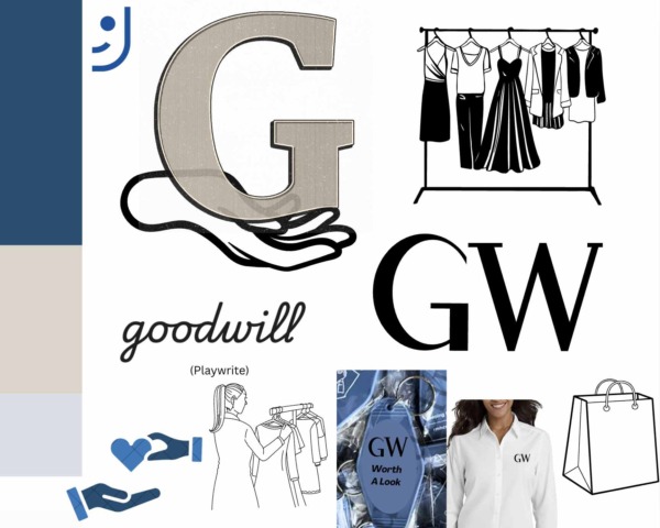
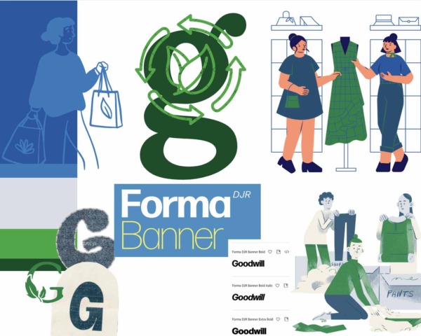
My first designed asset that helped me set the mood for the following pieces of the project was the slogan, icon, and logo. I even went on to animate this asset is AfterEffects to give it motion as it would potentially be used in content such as commercials.
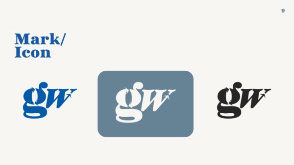
I solidified my slogan as “Second chances. Not secondhand.” This slightly altered their current model of slogan verbiage. Both to play homage to the “hand up” efforts of Goodwill and to carry through consistent motifs, I formed the W out of an up arrow and the G out of two circling arrows to communicate recycling efforts.
Defining Direction
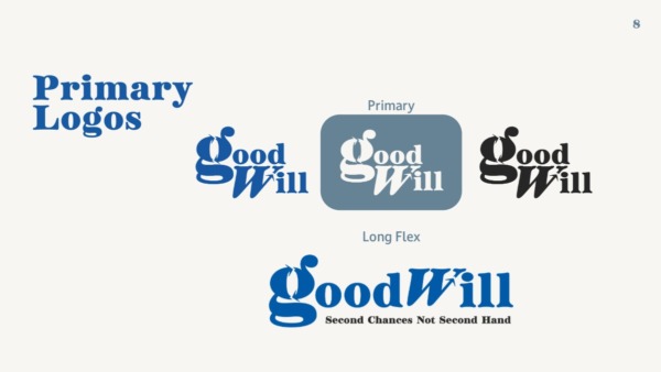
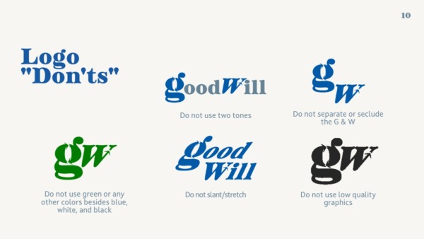
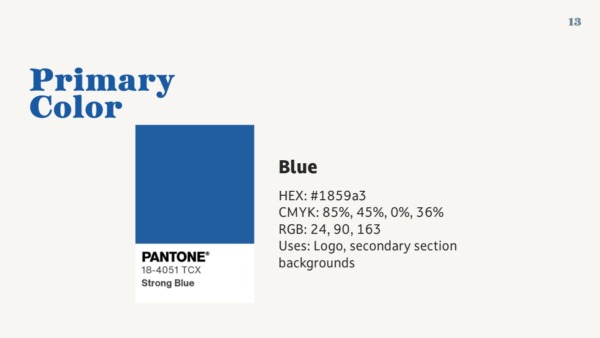
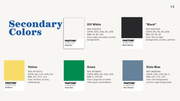
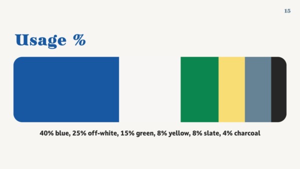
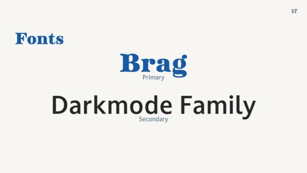
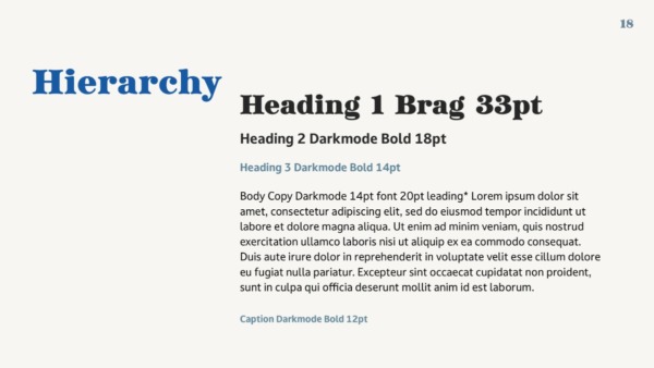
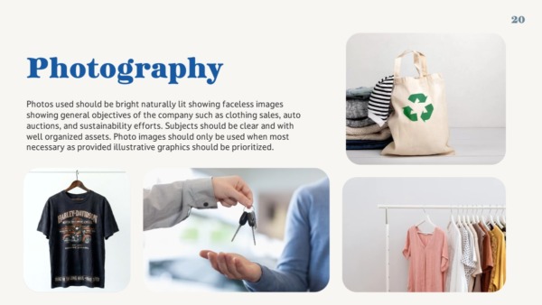
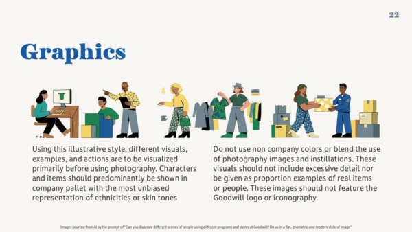
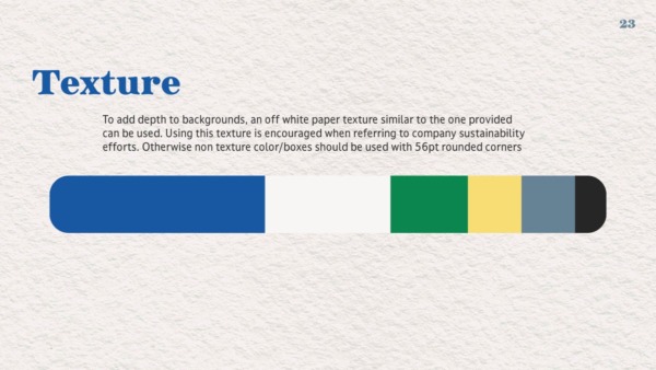
Finalizing my style meant I had to ensure there was a clear outline of how to execute designing branded content for future use – a brand guideline! Outlining color usage, fonts, and logo usage is important for future consistency of branding as well as ensuring assets are accessible for future audience members.

Application
Creating a logo and picking some colors is great and all, but the main challenge of this project was seeing how through my parameters, I can apply these brand design choices to content such as social media posts, packaging, merchandise
Merchandise
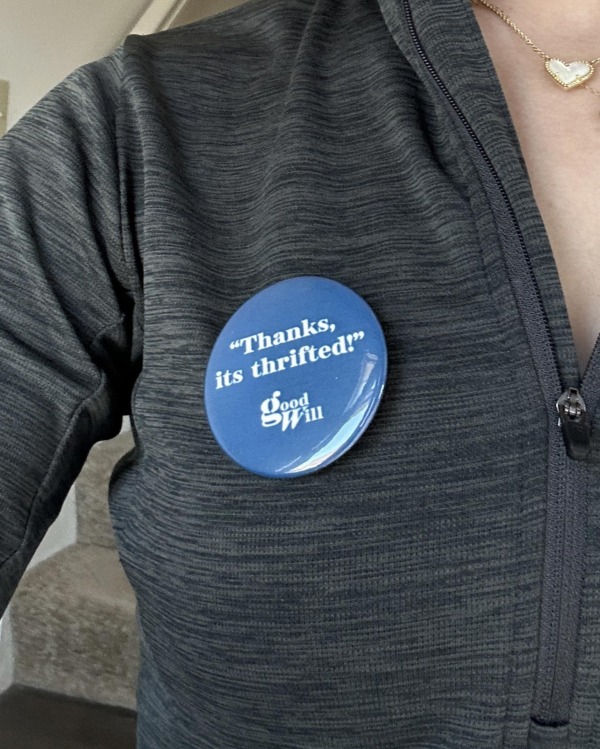
These three items I imaged, designed, and created are potential merchandise with my updated branding. These include a tote bag, button, and fidget toy. Making these items put my craftsmanship to the test as I created these all by hand with silk screen print, printing, button press, and 3D printing
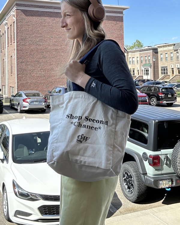
The tote bag was a clear choice due to the fact that it every customer could theoretically use it. The product itself highly aligns to the company’s value of being ergonomic. This gives customers of all audiences including caregivers, to shop while avoiding the extra use of plastic shopping bags that Goodwill otherwise gives at check out. The bag design features a spin off of my slogan emphasizing second chances rather than secondhand accompanied by my brand icon/letter mark. Physically, I created this bag by hand through silk screen printing the design with ink.
The “Thanks its thrifted!” button idea came to me in an outside situation when being complimented on a item that I myself had gotten from a Goodwill. Anytime this would occur, “Thanks its thrifted” would always be my response as well as something I’ve commonly heard from others as I compliment them. My goal for this was to attack some of the stigmatism around buying secondhand and celebrate it instead. This was incredibly important for me as people such as caregivers who may shop at Goodwill are doing so out of economic stress don’t feel as though they have to hide or be ashamed to wear a clothing item that is from the thrift store – plus the added brand awareness.
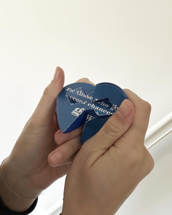
The fidget heart toy was created as a component to an imagined campaign that would directly address my parameters of caregivers as an overlooked audience. While the fidget toy is not a “thrifted” item, I organized this to be sold as an extended purchase to their online store at check out to be sent at the customers request to “someone who has given them a second chance” as caregivers relate to Goodwill’s mission to support others