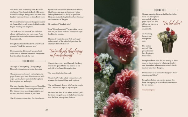
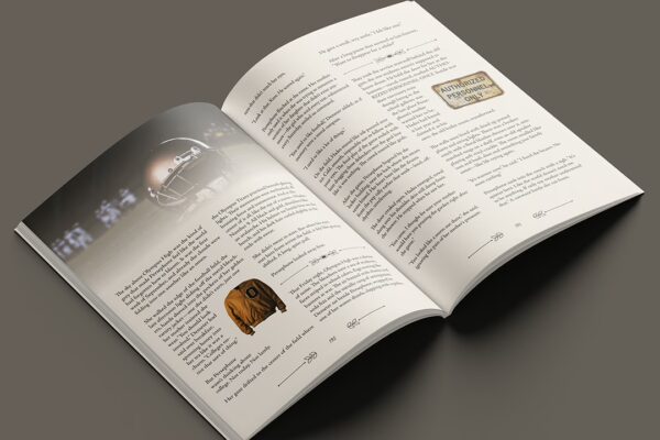
Publication and layout design
With this project I wanted to create a publication that made this greek story feel relatable. The glamour and drama of these myths are not as untouchable as they may seem. Stripping back the gold head dress, fantastical creatures, and eating from a vine, how can I show Persephone and Hades as a peer rather than a theological myth while also keeping their lessons alive?
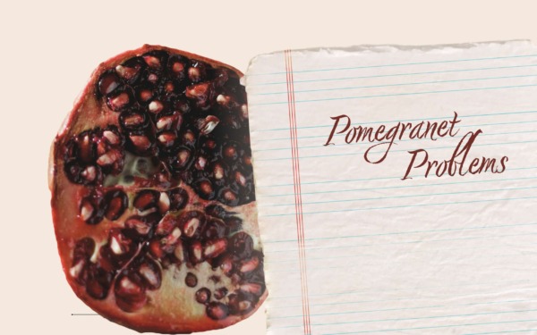
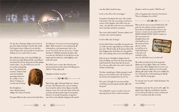
In March of 2025, I set to design a short story layout in which I generated the text via AI based off of a lore of my choosing. Upon the creation of a contemporary high school drama twist of the Greek mythology of Persephone and Hades, I wanted to create a story layout that reflected the high school text feel as if it was one of the books the characters would have carried through the halls of Olympus High.
“…how can I show Persephone and Hades as a peer rather than a theological myth while also keeping their lessons alive?”
Problem Statement
Ideation
Before doing any creating I scoped out layouts made in other publications and specifically looked into writings that had similar themes to my own such as love, interpersonal conflict, and student life. Doing this showed me a plethora of ways I can arrange text blocks, images, pull quotes, etc.
Starting to imagine the style of the pages, I collaged images that correlated with the characterization that was created through the plot and language of the writing. By this point, the story communicated a great deal of drama and deep personal conflict. While keeping the situational relatability I still wanted to incorporate some intricate detail that still payed homage to the greek story essence.
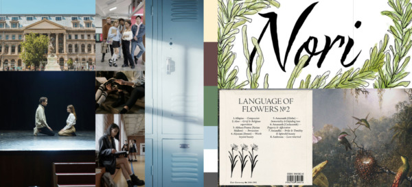
Planning
Once I had my text written out I was able to know what different segments of the plot that get its own designs. Before going into InDesign, I rounded up potential assets such as images that would be placed about my pages. Using some of my beginning inspiration and now what sections have coordinating images, I tested out different organizations and potential ornaments.
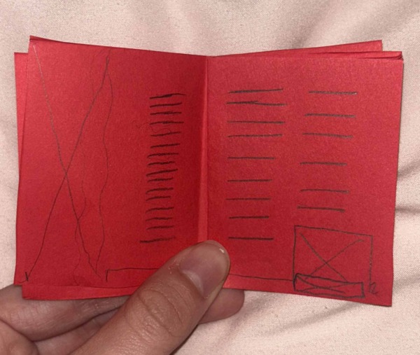
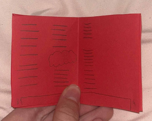
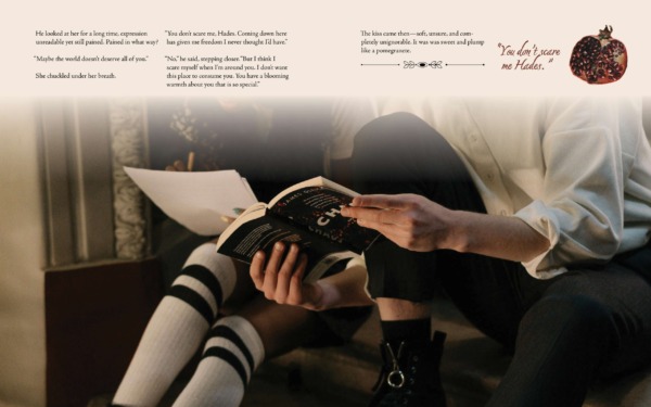
Nothing glamorous and small scale, but enough to help me visualize options without getting too deep into designing just for something to not work. One thing I learned here is that I wanted an image to show on a left page and come from the gutter rather than on the left and from the end of the page. This also ended up working best based on where a certain part of the story landed.
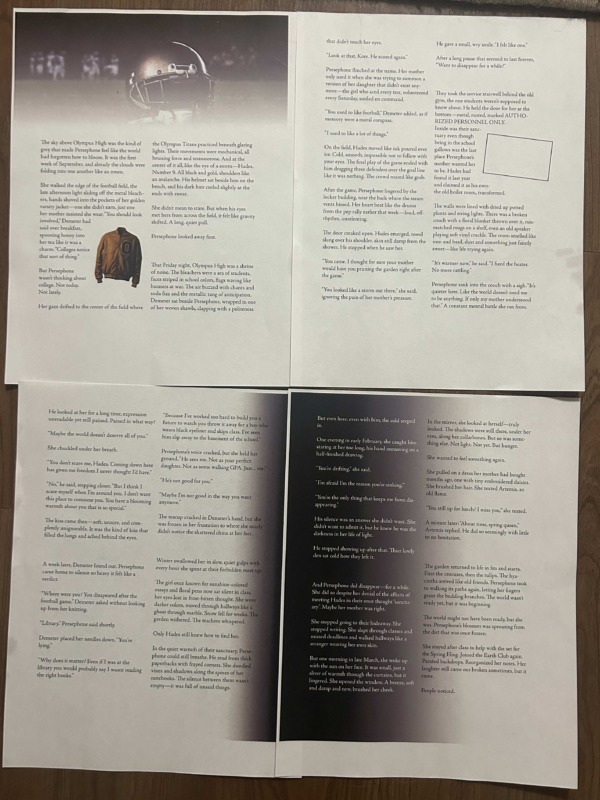
Similar to the mini practice pages, it was important to see designs unfold as they did so rather than assume the final product would be correct. Printing out pages as I added/took away/changed my pages was important since the transfer from screen to paper may lose the original intent behind some choices. For example, in the moody era of the storyline I wondered if adding a black shadow and switching the text to white would enhance the intensity of the situation. After printing I thought the design distracted from the story and decided against adding it, but I am glad that I tried it!
Shaping Up
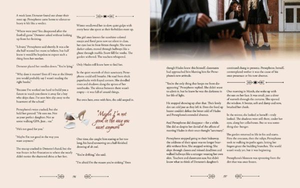
By the end I had 5 spreads of a short story I crafted. Using consistent motifs in theme gradients, spacing, and organization. What really caught my eye about this project is how it looks like it is an exerpt of a passage in an english textbook. This submerges you into their high school world and mindset which advances the experience of connecting with the drama of it all.